• Responsive Design •
What is it?
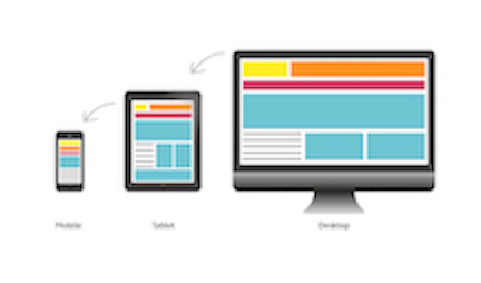
Responsive Design is a technique in which a webpage adjusts to the specific screen size being utilized by the user. It became necessary when we started accessing web pages from various devices besides standard desktops such as, various sized mobile devices and tablets.
There are Three main elements of a responsive design page. The first is a fluid grid, this is a crucial element to ensure your design is responsive. The second is flexible text and images, to ensure that the font is a readable size and the photos format properly in size as well. The third and final element is media queries, a code that powers the flexibility of a layout on responsive websites. They specify the CSS to be used depending on the devices specific break even point. These three design element together have helper developers be able to create user friendly content easily.
Why is it important?
Beginning in about 2010 people started to convert their webpages to incorporate responsive designs. If you attempted to view a webpage that did not have a responsive design from a mobile device it would be nearly impossible to read. The page would format to fit the small screen and you would have to zoom in for it to even be legible. A very hard task when you are trying to read content or navigate the page.
It is important to use a responsive design for you webpage so that consumers may access it in an easy-to-read, user friendly, and consistant format regardless of what their device screen size is. A study was done and found that 40% of consumers have ended up going to a competitors webpage to make a purchase after having a bad user experience. In an on the go world its important that your webpage looks good where ever they are viewing it from.
Competitior Website Analysis:
I chose four different spa businesses within north county to compare websites too. All of them utilized responsive design techniques on their sites. Some sites where done better than others. The simpler sites seemed to format better when we reduced the browser window. For instance, Pash Skin Studio's navigation bar stacked where as Karma Spas disappeared making it a little more challenging to navigate. Overall, even though all of the sites where responsive, the layout and style of the page still influences the flow of the design.