• Apotheque Lifestyle Spa •
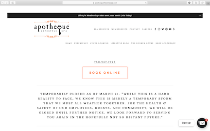
Apotheque has a really basic single column website. They have a lot of content on their site as they are a pretty diverse spa. The main issue is that the home page has a lot of content, like A LOT of content.
The only photos are from event flyers in the announcement section or links to their blog posts. It is very confusing and hard to find out basic information if you are a fist time user.
I think that they should organize their page better and incorporate sub-navigation to break up the content and make things easier to find. Not many people will scroll down the whole page to find what they are looking for. This will give the page a better flow and make it overall more aesthetically appealing.
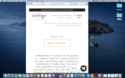
The webpage does use a responsive. When I made the page smaller the navigation actually went into a dropdown folder that I really liked. I think this looks better than the original design as they have so much going on. The font stayed the same size so the content remained easy to read. I think that I like the smaller version of the website better.