• The Work of Istvan Brinza •
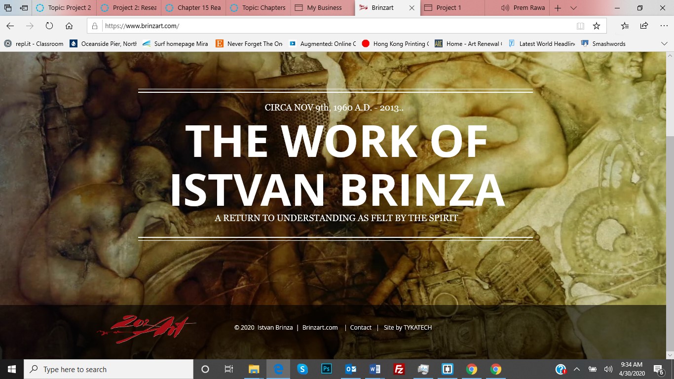
This site is a portfolio for an artist named Istvan Brinza. I have chosen this one for the aesthetic look and feel as you navigate the many images. I feel artwork influences the user’s experience. If you can maintain a visual appeal that continually develops, you can hold their attention for a long time.
If you investigate this site, you will see the simplicity and elegance used to showcase the artist and his work. Much of the site reminds me of our assignments and your examples. Using overlays, transparency, and arrangement are in full display. The artwork (Still Life) displayed is in the same ratio (16x9) but it is hard for me to conceive an artist would always paint on the same size as the canvas. Regardless, they are all beautiful to behold.
I feel the naming convention under each painting is terrible. It removes the audience from the emotional connection you have with the art on display as a thumbnail. The background imagery is also competing with the thumbnails, which I feel is a mistake. There is also a bit of a Gieger-ish feel to the background that I always find disturbing. The site is still very attractive for simplicity and display qualities.
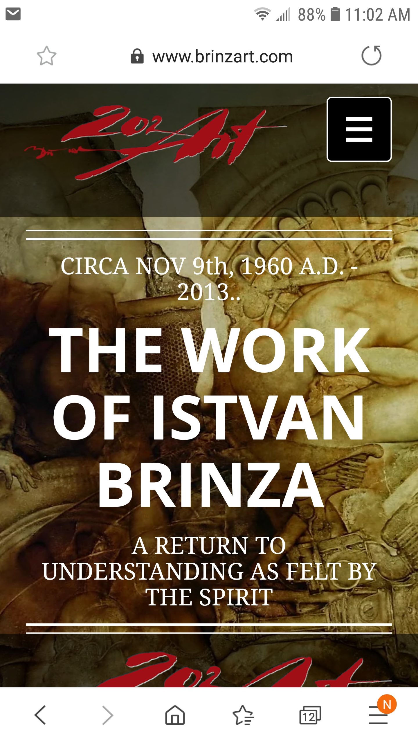
The website is responsive. As shown in the photo. This is how the same content looks on a cellphone. The page still has a good flow and looks well organized. Although I feel studio art should not be seen via a phone. What is the point?