• Humans of New York •
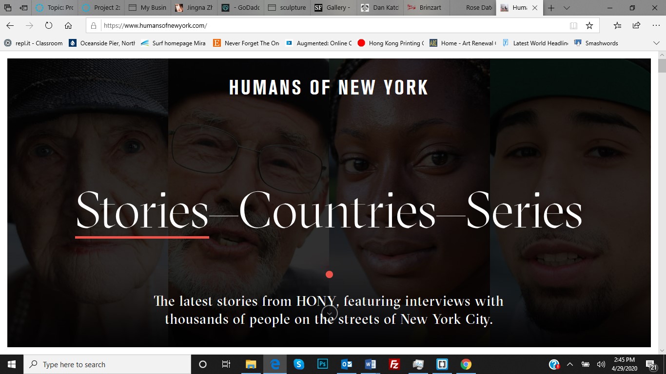
Humans of New York website feature a simple two-column design. It is spotless, with no advertisements or pop-up windows. The style appears to be contemporary, designer elegant. It is easy to navigate. When using a cellphone, only one column is present at a time. Again, very easy to read and elegant to scroll to the next story.
Nothing disturbs the reader from the content. Photos are consistent and visually tell or support the story it represents. I think most readers would agree the site makes for very pleasant user experience.

I like that he is the photographer and the stories feel authentic with a humanitarian feel. If you scroll to the bottom of the page, there is a jump tag asking if you want more stories. This invitation will continue adding more stories to the bottom of the page in an endless sequence. I think keeping it simple has a lot of advantages with a responsive design. Text is easily scalable on a smaller screen.
The website is responsive. As shown in the photo, is how the same content looks on a cellphone. Two columns transitioned to one for easy reading. The page still has a good flow and looks well organized. I think for my project I will mimic this site but add my artistic spin on the imagery.