• Humaan •
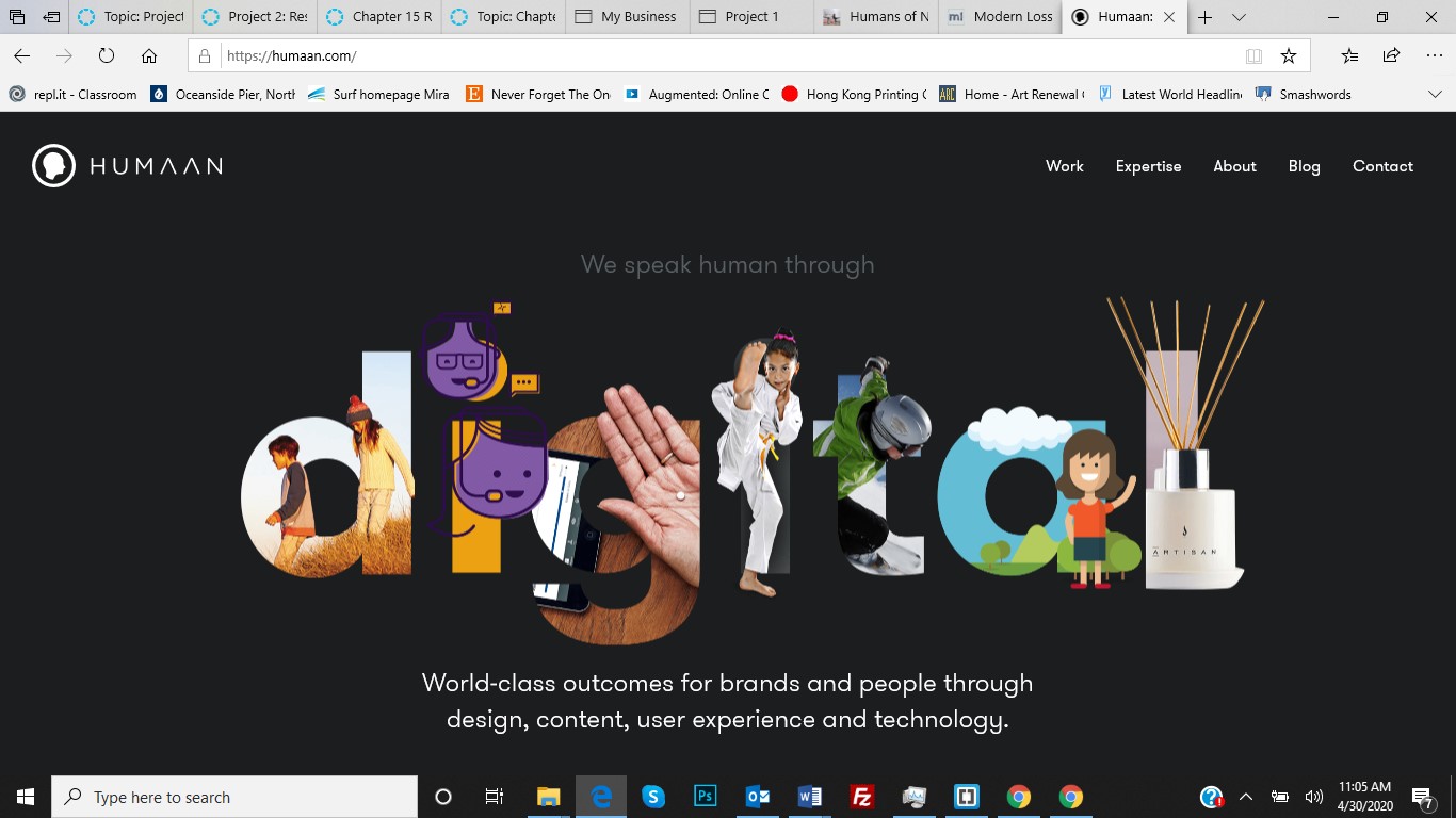
I have selected this one for its design layout. This is a company that designs luxury brands. If you move to the second screen, you will see some movement and I don’t have any idea how they did it. Flash is dead. So what tools did they use for this sequence of events? Do you have any ideas? I felt that when I move from one story to the next, I would have a transition that would feel you are opening into something deeper still. Similar to how Google always has a different logo on their page, I would have several transitions that felt fresh and unique. Maybe not at first, but over time I would continue to add more and more of them.
Nothing disturbs the reader from the content. Photos are consistent and visually tell or support the story it represents. I think most readers would agree the site makes for very pleasant user experience.
On the following pages, you will find one of their showcase websites they designed that appears to have won the “Site of the Year” award for 2017. Sodashi is the site. A skincare product directed towards women. The elements I like are the subtle “arrow” that is carved into the splash screen pointing downward. An elegant way to direct one's attention. Scrolling results in the discovery of the products available.
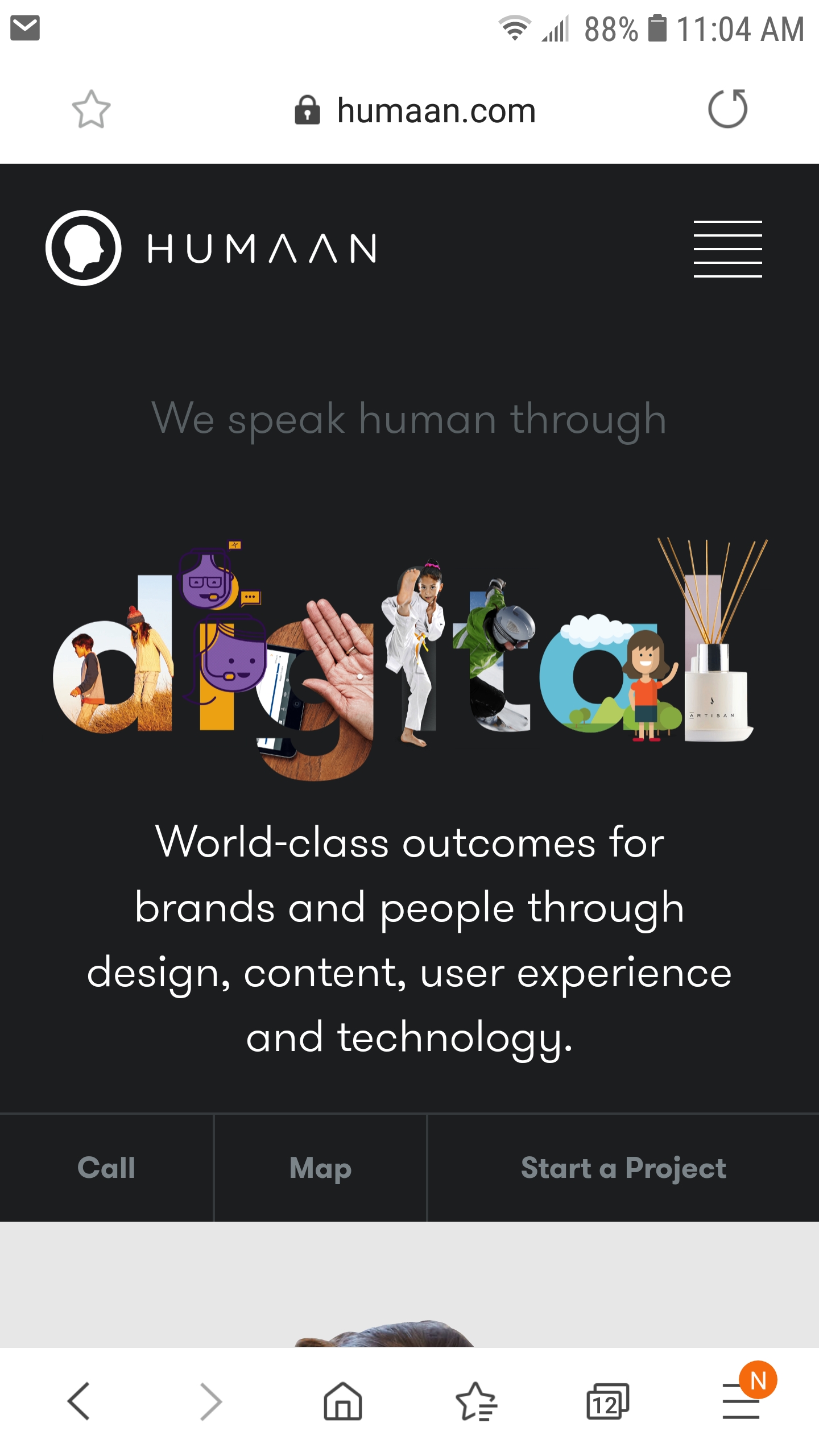
The website is responsive. As shown in the photo. This is how the same content looks on a cellphone. The page still has a good flow and looks well organized.